Visual Identity Systems
Visual Identity Systems
from €218,70
Complete visual systems: color palettes, typography selections, imagery direction, pattern libraries, and layout grids. Everything that makes a brand look consistent.
Complete visual systems: color palettes, typography selections, imagery direction, pattern libraries, and layout grids. Everything that makes a brand look consistent.
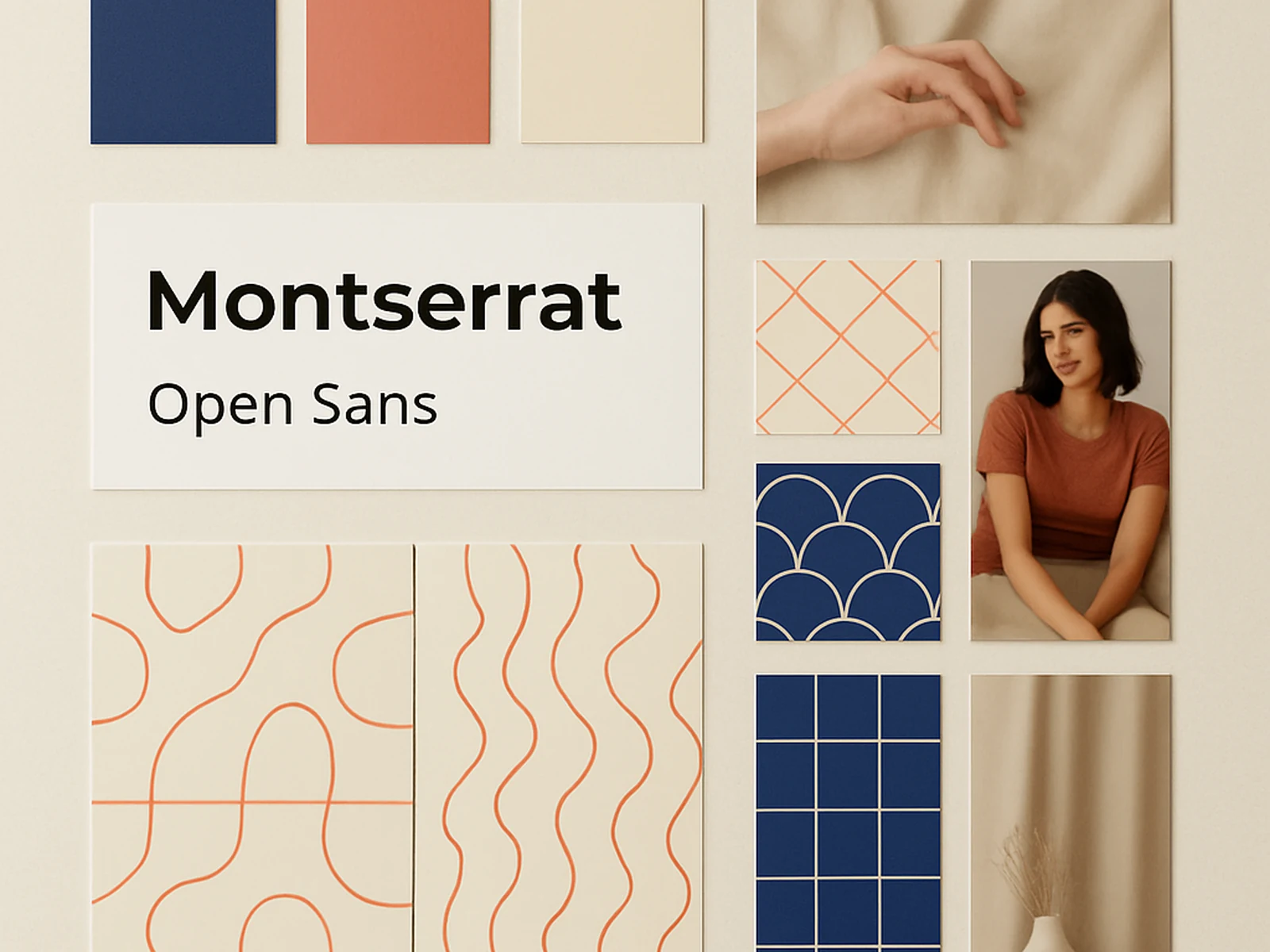
A logo alone is not a brand. You need a visual system that tells people who you are before they read a single word. The colors, the fonts, the way images are cropped, the style of illustrations, the grid that holds it all together. These are the things that create recognition over time.
Primary and secondary color palettes with exact codes (Pantone, CMYK, RGB, HEX). Typography selection: heading font, body font, accent font, with size and weight specifications. Imagery direction: photography style, illustration style, icon approach. Pattern library if appropriate. Layout grid system. Rules for composition and hierarchy.
We do not believe that blue automatically means trust or that green automatically means nature. Color works in context. We choose colors based on what your competitors use (so you look different), what your audience responds to (based on research, not assumptions), and what works technically across print and screen.
Online · Alcamo